
Styling Tip: Using an Accent Color
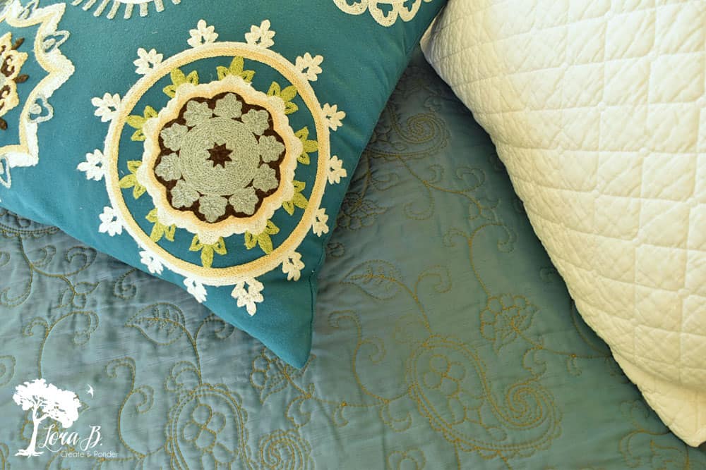
Last fall I used orange as an accent color in our mostly neutral white and yellow bedroom {Here}. Before Christmas I scored this beautiful, Peacock-colored matelasse bedspread at the thrift store for a song. (And in case you’re wondering…matelasse (n) is “an embossed, compound fabric woven on a dobby or Jacquard loom.“)
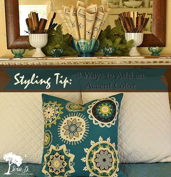
I’ve never used this color in our bedroom before, but decided it would be my winter accent color to change things up a bit. I decided to borrow this pretty Home Goods pillow from last year from my living room that has a snowflake-inspired design on the front.
When adding an accent color to a room, use the law of threes:
Use the color in 3 different places
Use the color on 3 different planes
Use the color with 3 different textures
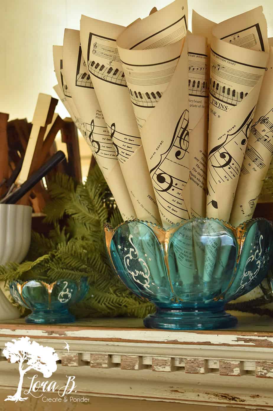
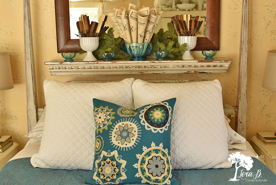
Using the Peacock color on the bed inspired me to dig out an antique glass bowl set that was a family heirloom. Dishes in the bedroom you say? Of course! I use them everywhere!
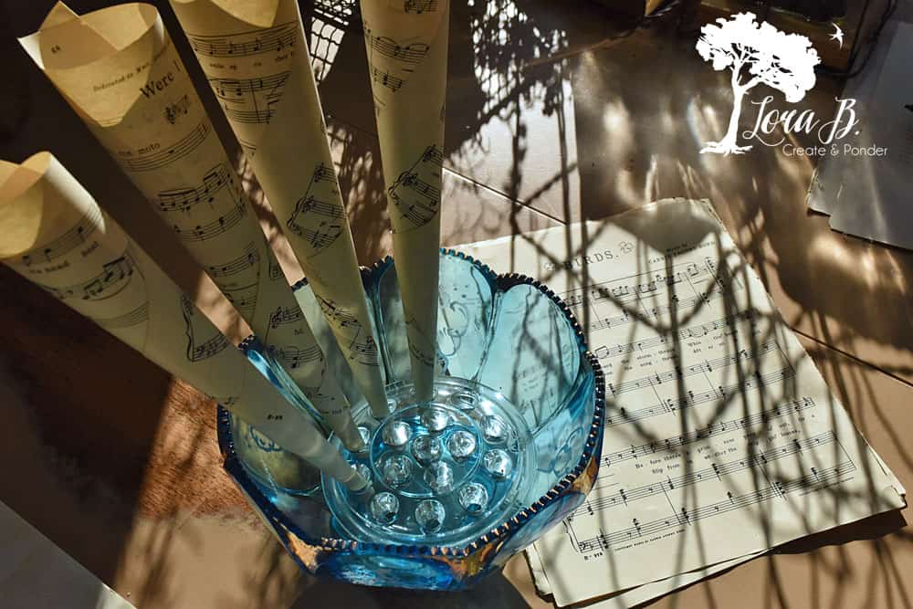
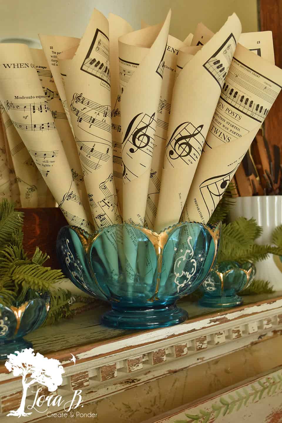
I wanted the bowl to have some type of filler and decided vintage sheet music worked for Valentine’s day (“Love Notes”), but struggled with how they would stand up. I went and grabbed a large glass frog which fit perfectly in the bottom of the bowl. I rolled up a bunch of music and glued it with my hot glue gun and stood them up in each hole.
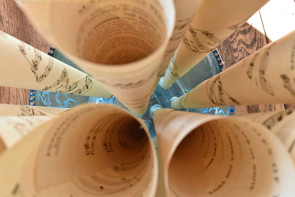
Inspired by the treble and bass clefs, I faced the trebles out for my side of the bed, and the bass clefs facing out on Mr. Fix-it’s side of the bed. (He will never realize this unless he reads this post;)
I love adding a little humor to styling!
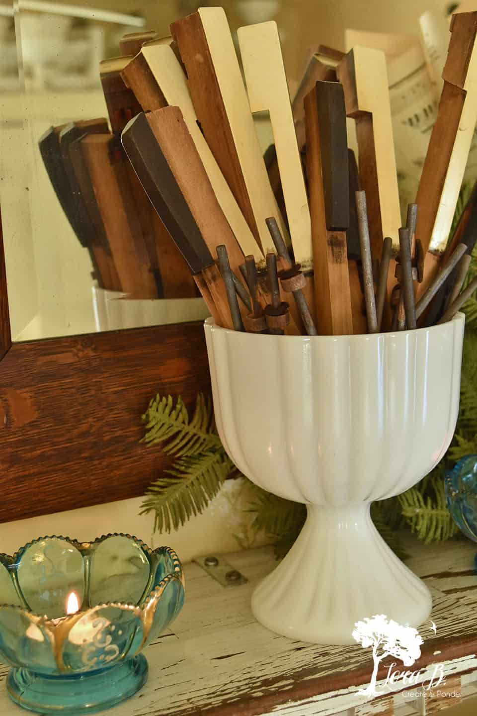
The white milkglass pedestals were still on the mantle shelf from fall (which you can see in the linked post above). I filled them with leftover pump organ keys from a roadside beauty we had disassembled years ago.
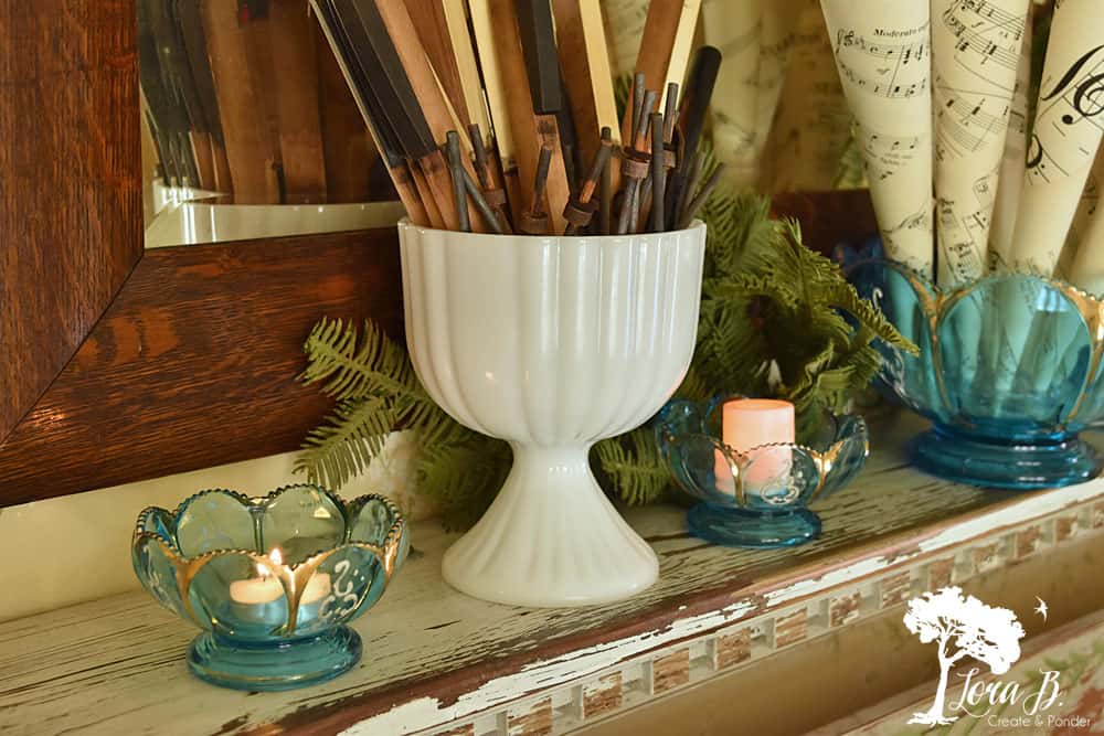
In the little bowls I can use real candles or fake for some Valentine romance and night-time glow. The pretty gold painted accents will glimmer in the candlelight.
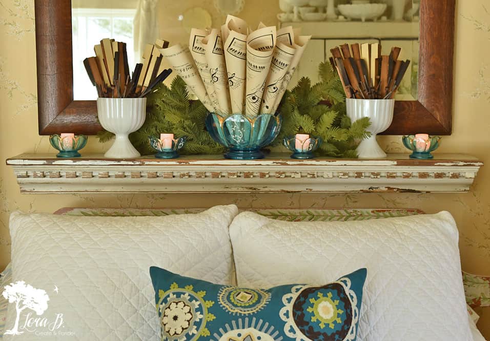
I’ve got my accent color on the bed (fabric), and my accent color on the shelf (glassware) and they’re on different planes (low, high)..now to add it in a third place with a third texture..
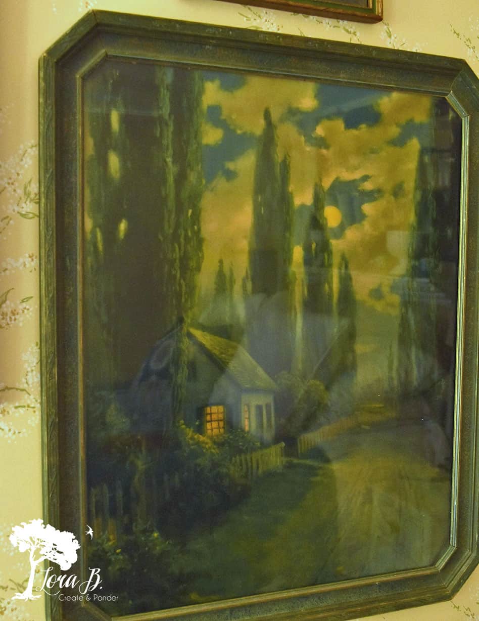
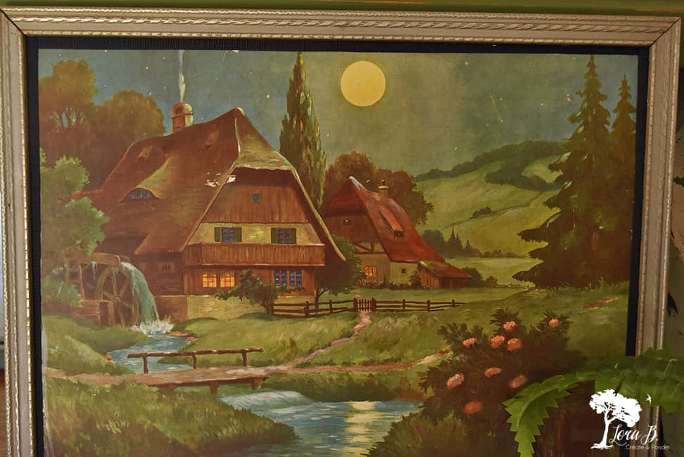
Vertical space. I had totally forgotten these two beauties when I did my R.A.Fox post {Here}. I hung the three prints that all featured a yellow moon…for sleeping…for a bedroom. They have the pretty, Peacock-colored, night-time sky. I combined them with some white painted, fresher frames so as to not get too old looking. I like vintage, but don’t want my home to look like an antique store.
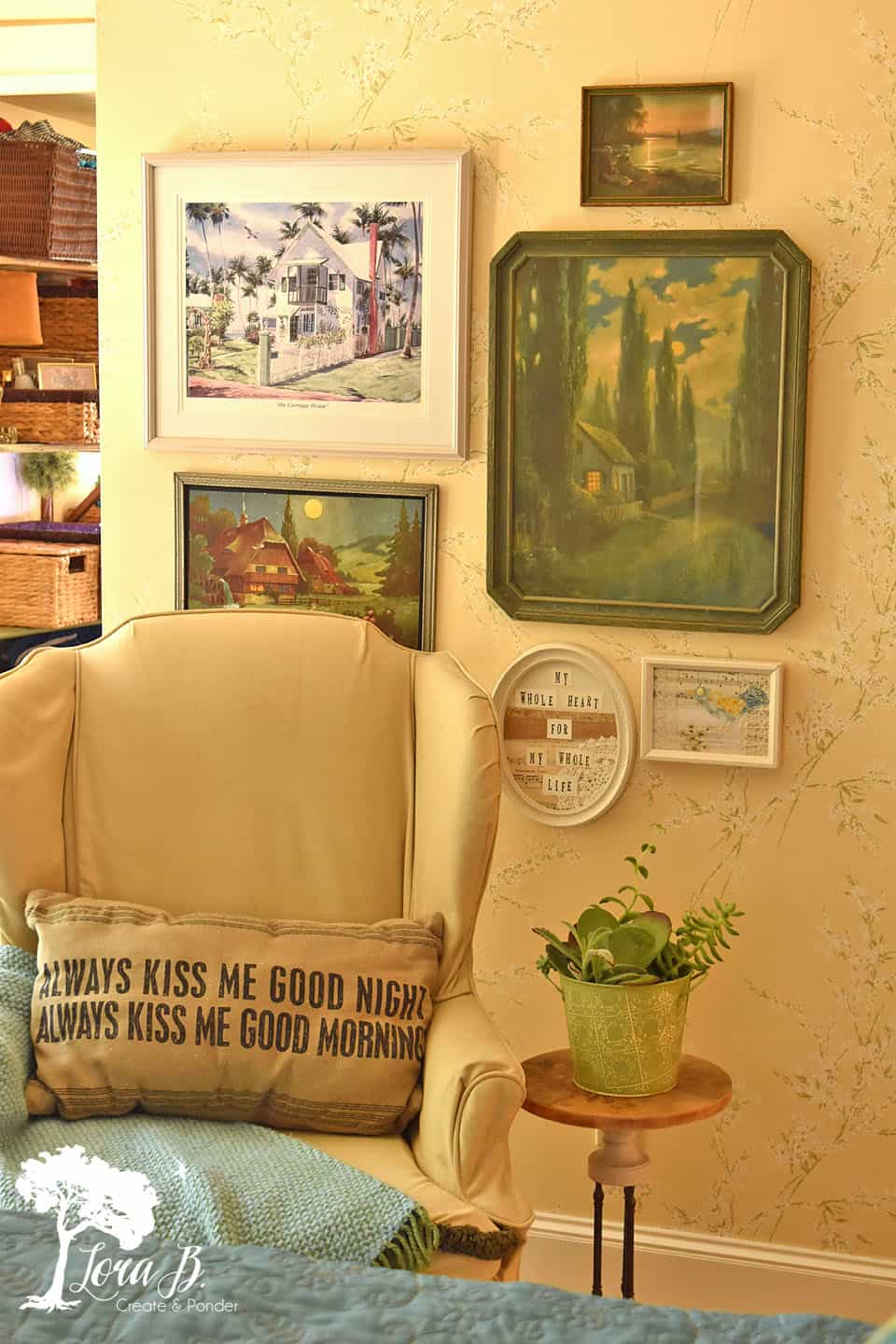
There’s our freshly cleaned and organized closet ironing board shelves in the background.{Here} I also borrowed an aqua and green afghan from the kitchen for a fourth pop of the accent color.
Adding an accent color to a room in at least 3 different places is like instant gratification decorating! And if you can borrow items from other rooms of your house, there’s little expense involved. What a great Valentine’s present to yourself!
 If you’re itching for some other changes around your home, check out another of my styling tip posts, “Consider shape in your Styling” {Here}.
Pin for future reference!
Linking up with these parties:


Thanks Lora for teaching us about the rule of threes 🙂 You did a great job giving your MBR a refresh; I especially like how you styled your mantel piece. Thanks for linking up your post with us at Vintage Charm–
Thanks, Diana! It’s fun to see a whole new color!