Get Some Greenery!
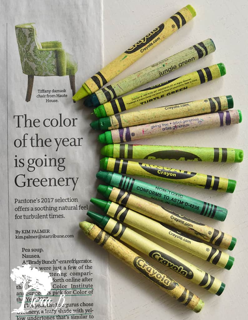
Pantone Color Institute has announced that “Greenery” is it’s color of the year. Since it’s the first full week of March and we’re celebrating St. Patrick’s Day, I thought it would be fun to have a whole week devoted to the color green: green decorating, green food, planting green and making some green ($).
What’s Pantone, you ask? It’s the leading color thinktank that “helps companies make the most informed decisions about color for their brands or products.” Their website explains they do color trend forecasting, brand color development and custom color solutions. Most of what we see in the home fashion and design world first filters through them.
Back in December, Kim Palmer of the Star Tribune (Homes section 12/11/16) described Greenery as “a leafy shade with yellow undertones, similar to chartreuse.” Her article went on to seek insight from interior designers as to what they thought of the color green. Some described green as soothing, representing nature, a nurturing color.
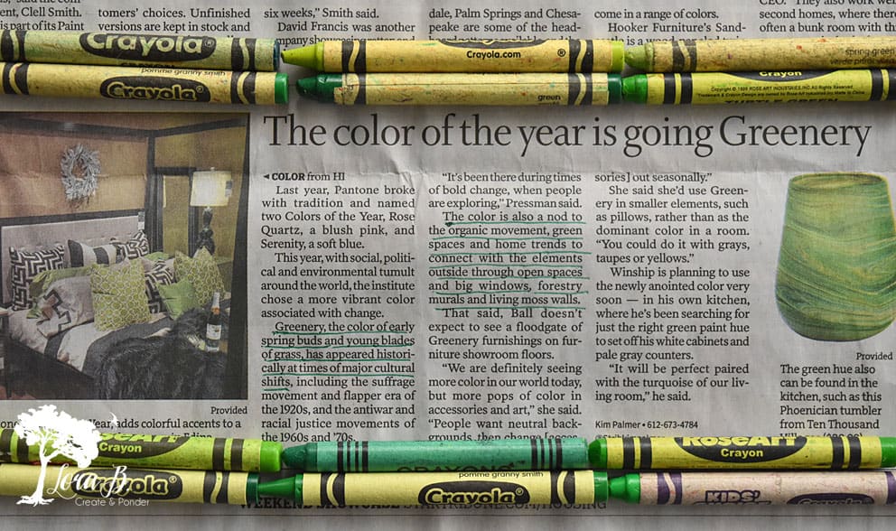
Kim says this spring-like shade of green “has appeared historically at times of major cultural shifts”. The color naturally comes out of the green, organic movement that we’ve been experiencing for awhile.
I, for one, am thrilled with this new resurgence of green! It’s not only my favorite color, but I am convinced of it’s power to add life and beauty to any room or display.
It comes in a wide variety of hues to appeal to every taste. There are gray-greens, yellow-greens, forest-greens and mint greens. Whichever hue you’re attracted to, adding green to your surroundings and displays is like shaking a bit of salt on your meal; it makes all the other flavors come to life!
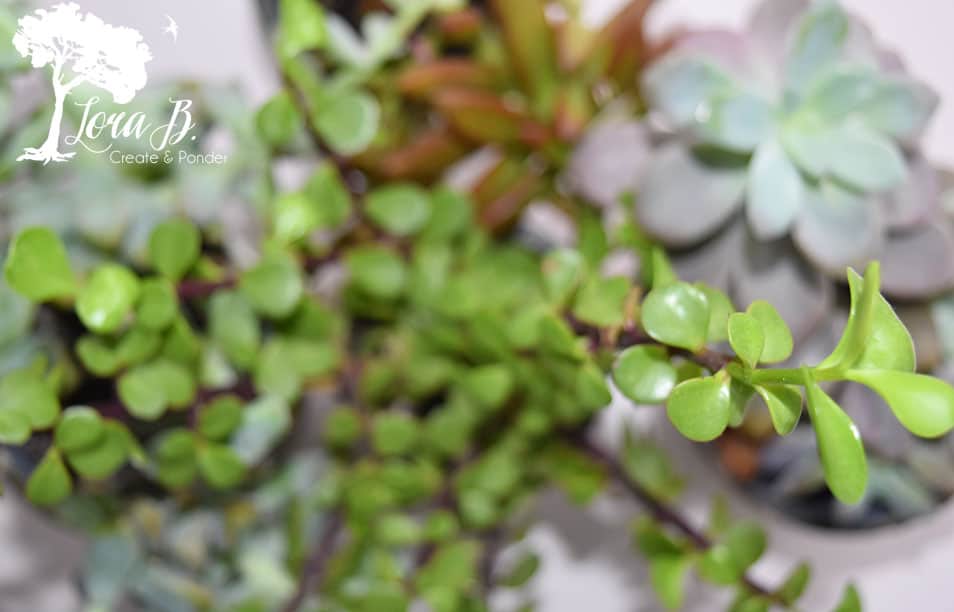
I have styled so many beautiful homes where they don’t realize the impact of adding some live or fake greenery can have to their surroundings. Just adding a little green to the corner of your kitchen counter can bring freshness to the whole room, including the air quality if it’s real.
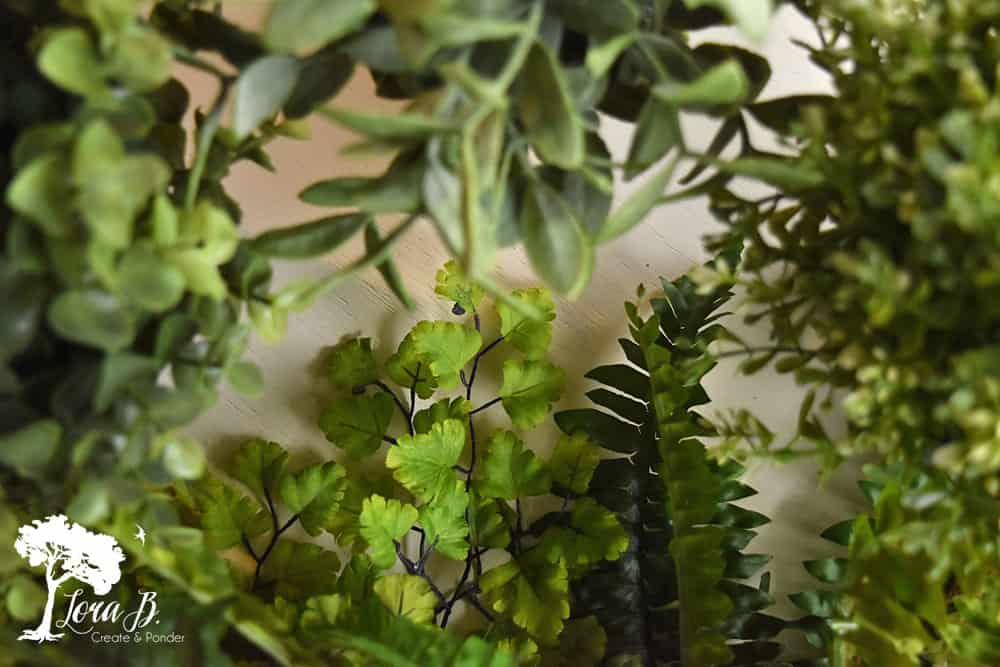
Adding a fake plant to an interior bathroom that has no windows can bring a touch of the outside in. It will far supercede any other color you introduce, or add to it exponentially.
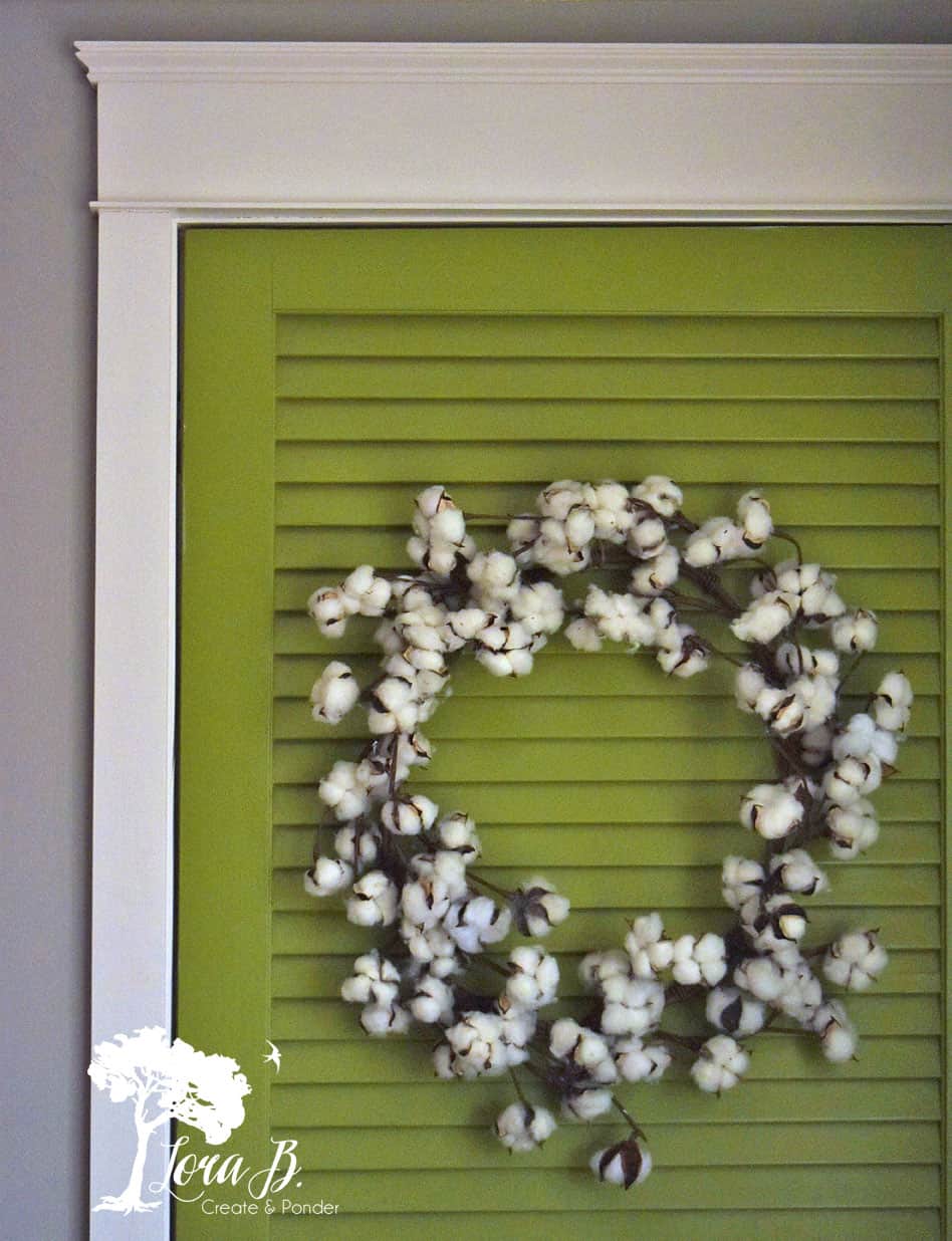
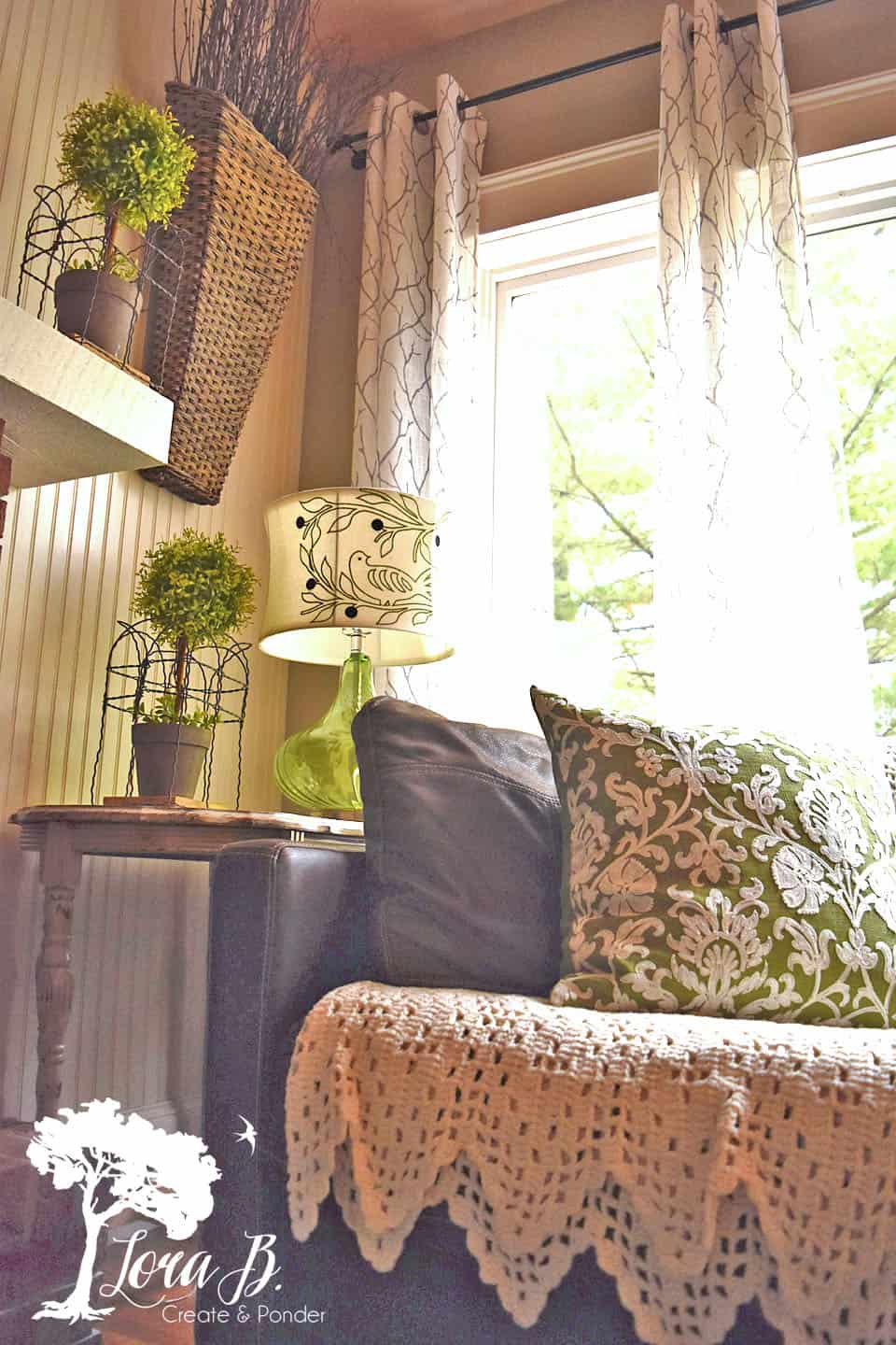
In my home green is used as a neutral. It’s just as important as brown, white, and black. It is seen as backdrops on furniture, this 60’s painted shutter door, and architectural items I’ve got hanging on the walls. I can swap out feature colors displayed over the green seasonally.
In winter, white looks crisp and clean against a green backdrop, in spring I add sweet pinks and yellows. In summer and early fall golds and oranges work beautifully with it, and of course classic red and green are a classic combo at Christmas.
Don’t underestimate the power of green in your home or displays. Take a close look at almost every magazine layout; there’s always a spark of green somewhere in the photo. Stop in at a big box store and pick up some fake plants, or if you can keep them alive try some fresh ones. Your home will look just like you gave it a little sprinkle of salt to bring out the flavor!
