Consider Shape in your Styling
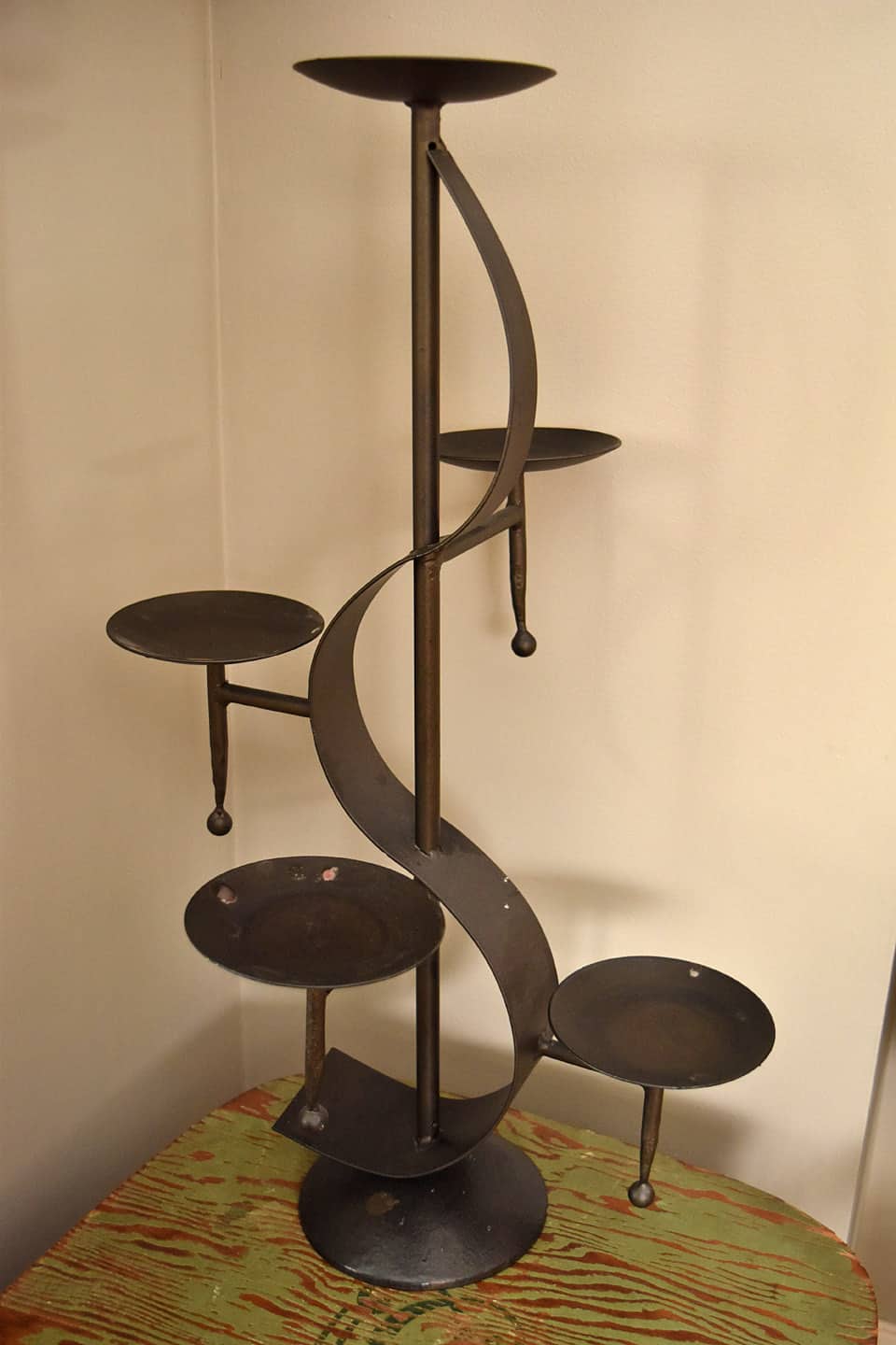
I picked up this interesting accessory at a church sale last fall. It was sitting on the ground, partially hidden by some other stuff under a table. I lifted it and realized it was quite heavy. Maybe some of you can help me, but I’m guessing it’s from the 70’s, Mediterranean style…which I’m not usually attracted to. Think sister thought it was ugly and I’d lost my mind.
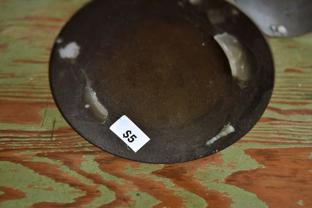
I liked the price and the funkiness of it. I’m guessing someone had candles on it, from the looks of the dried wax. I pictured little pumpkins on each shelf for fall and Shiny Brite ornaments on each for Christmas.
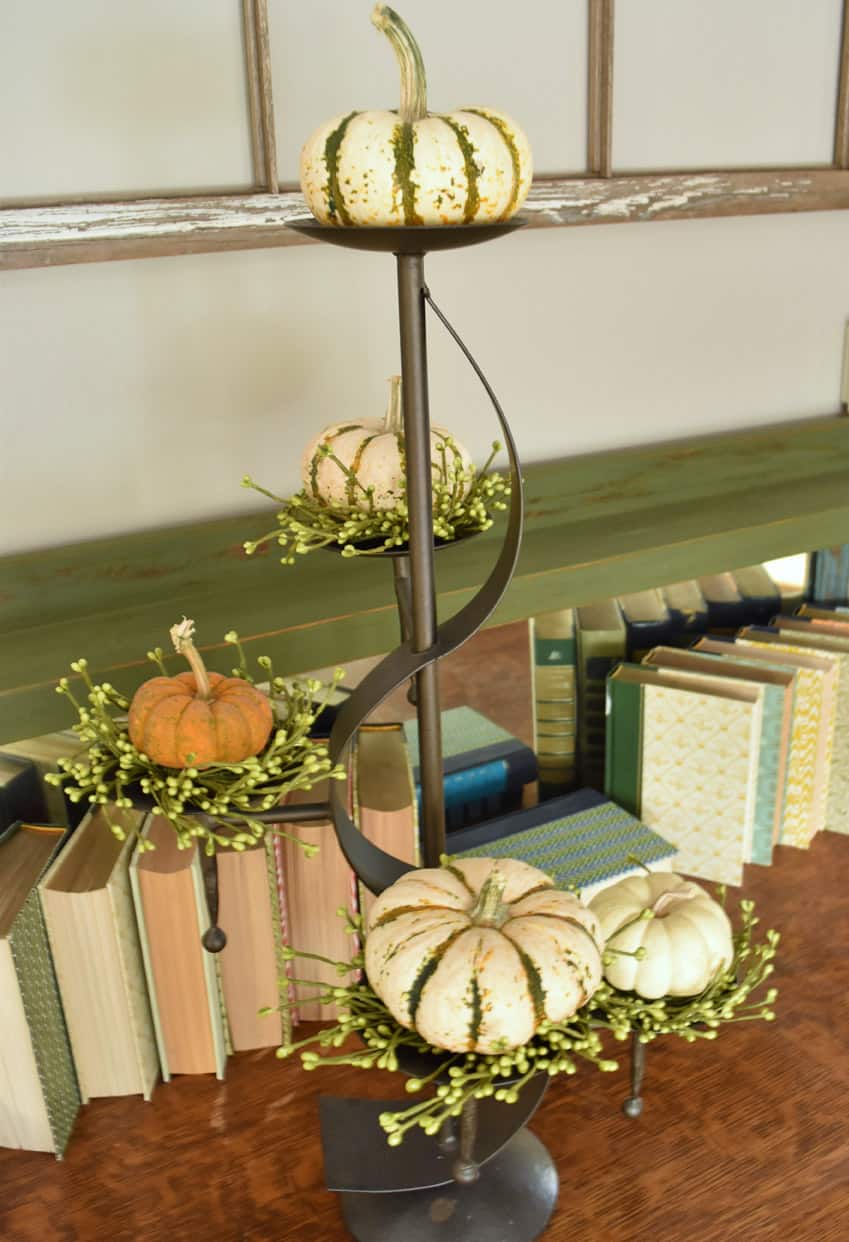
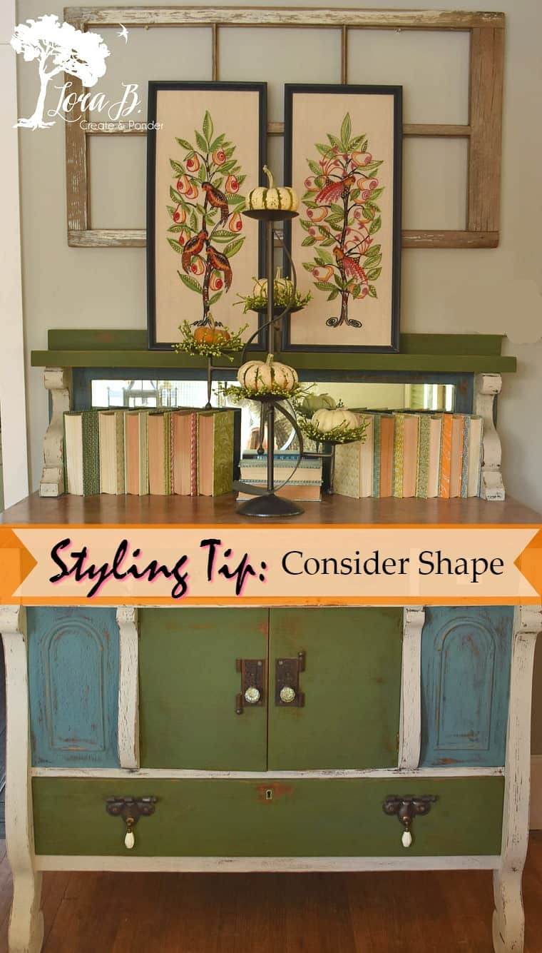
I set the display on my masterpiece buffet (Here). I leaned up two framed needlepoints my Grandma had done back in the day; I’d refreshed the frames with some black paint. I was loving how all the pretty fall colors were playing off each other, along with the definition of the black.
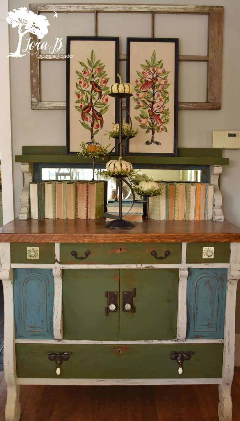
(If I could just airbrush out that ugly thermostat! Maybe someday…)
Once again, I surprised myself with how my eye coordinates shapes that are on different pieces, and brings them together for a harmonious look.
The buffet has empire-style details, with it’s curvy legs:
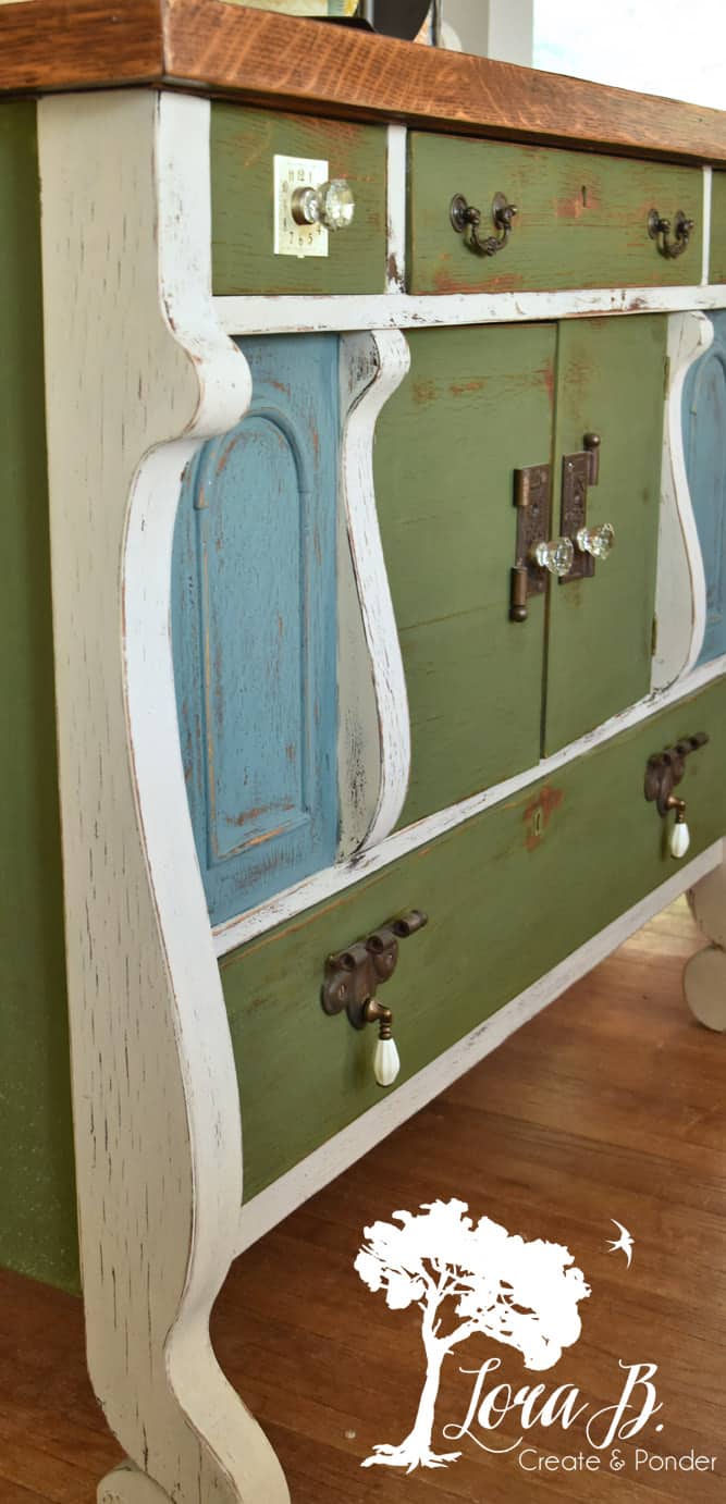
Which is juxtaposed with the square, boxy body. I love the combination of the curvy, feminine details with the strong, square-ish shape. I’ve always tried to find this perfect balance in all my decorating (and my logo, as I’m seeing right now).
The S curve of the candleholder echos the shape of the furniture, and is then strengthened with the curvy, black trees in the needlepoints. The colorful books and the window frame backdrop anchor the square/rectangular foundation that grounds it all.
Repeating design elements or shapes is a great decorating tool. Many times you’ll notice this on the photo chosen for the front of a magazine. They will repeat a shape on the furniture, the fabric, and the wall treatments. It’s easy on the eye and creates a harmonious grouping.
When you think of the 60’s, design was all about circles; big hoop earrings and radiating gold circles were all the rage. In my previous house, I found myself always decorating with squares, probably influenced by the cape cod gridwork windows. In the fake farmhouse, now, I find myself using a lot of lines, probably because of the tall ceilings and our new, lined windows.
I think it’s fun to group pieces from different eras, coordinating them with their shape. It creates a much more personal, eclectic vignette. Using this trick in your booth or store will also create appealing groupings.
Look around your home. What shapes do you gravitate toward? Have you noticed this concept in magazine photos?
Pin, so you can remember!
Linking up with these great parties (click on button for link):
I’m picturing pastel pottery with succulents and other greens this spring. Lots of possibilities with this fun piece.
Oooh, I like that idea, Cheryl. Pastels with the black outline-always a good thing! Nice to still be able to find some treasures:)